
Want to save time and make more money?
Want to save resources while running your business?
I think we all do, right?
Being more efficient and productive is important for all businesses if they want to do any of the above. And that’s exactly why I converted my website to a WordPress powered content management system (CMS) with the help of the Genesis Framework.
By converting my site to a bespoke WordPress website using the Genesis Framework I’ve been able to save time, money and increase performance for both:
- End users – By improving my website user-experience, and for…
- Myself as a freelance designer – By making my website easier to update and grow….
Here’s how I did this and you can too…
Table of Contents
Saving Time and Money with WordPress
As I mentioned, one of the main reasons for converting to WordPress was to become more efficient. The more efficient I can be in maintaining, updating and expanding a website the more time and money I save or free up for use elsewhere, and this holds true for everyone wether you manage your site yourself or through a third party.
Updating my old website was a bit of a pain to say the least.
Adding a new project to my portfolio meant opening up and editing a huge number of different HTML files in a text editor before finally uploading them all to the web again. It was extremely time consuming, cumbersome and tedious task.
The process was very similar for any other part of site also. As for attempting to set up and run a blog through a traditional HTML or non-CMS powered website, well I won’t even begin to explain how much of a pain this would be.
HyperText Markup Language (HTML) is the standard markup language for documents designed to be displayed in a web browser.
Wikipedia
– Wikipedia
Having now converted to WordPress via the Genesis Framework I can now simply login, update, maintain or add to my website via a password protected backend admin area that’s accessible through any Internet browser such as Firefox or Chrome.

Adding a new portfolio project is now as simple as navigating to the “Portfolio” section I’ve built (via a WordPress custom post type), clicking “Add New”, entering the new projects details into a few admin panels, uploading the images and then hitting the publish button.
Doing so creates a new, live web page containing my all chosen images and project details based on a reusable, custom WordPress template that I’ve previously designed and programmed.

At the same time a thumbnail link of the project is automatically added to both the top of the portfolio page and the home page “latest work” section, pushing the oldest entry off the page and into the archives. Voila! Dynamic updates across the entire website, including any relevant links such as ‘next’ and ‘previous’, all without the need to edit multiple files or pages. So, so much easier to edit, maintain or expand!

The process is very much the same for any new pages I wish to add to other areas of the website or for posts I wish to add to the blog your reading now. You simply click the “Add New” page button and a new web page is created based on the template you select.
Filling out your web page as simple as using a very basic piece of word processing software and, as long as there’s an Internet connection, you can carry this out using any computer, anywhere in the world.
Easily Adding Website Functionality with WordPress
The WordPress conversion has also enabled me to take advantage of the many great free and premium, paid plugins available that allow you to easily expand your WordPress websites capabilities even further.
Going into plugins in detail is best saved for another post post but some of the excellent free plugins I’ve used and installed to enhance my site include:
- W3 Total Cache – Increase your website page load times and performance.
- Rank Math – Easily improve your search engine optimisation and rankings.
- iThemes Security – Easily increase your websites security and protection against malicious website hackers and bots.
As well as wonderful premium plugins, such as:
- BackupBuddy – Automatically backup and protect your site from disasters.
- Gravity Forms – Quickly and easily create website forms.
- Thrive Leads – Easily create opt-in forms and grow your email list.
Increasing WordPress Site Speed and Performance
A number of technical improvements have also been made to improve the websites loading time and overall performance…
Google has explicitly stated that faster loading websites equal better rankings in their search results. Therefore a quicker website means better search engine positions, more traffic and more customers.
Speeding up websites is important — not just to site owners, but to all Internet users. Faster sites create happy users and we’ve seen in our internal studies that when a site responds slowly, visitors spend less time there. But faster sites don’t just improve user experience; recent data shows that improving site speed also reduces operating costs. Like us, our users place a lot of value in speed — that’s why we’ve decided to take site speed into account in our search rankings.
Google
A faster website also means you are less likely to loose visitors due to pages loading slowly. It creates a better overall experience for users meaning visitors are more likely to stay on site for longer, return again in the future, promote your website on social media and ultimately convert into customers.
A one second delay in page-load time equals 11% fewer page views, a 16% decrease in customer satisfaction, and 7% loss in conversions.
ConversionXL
Below is screenshot from a Pingdom website speed test of my home page. As you can see my site is now 94% faster than all websites tested, with an incredibly fast load time of 0.681 seconds!

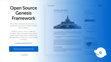
One of the benefits of launching or converting your website using the Genesis framework is it’s clean code base and foundation, which creates fast loading websites that the search engines love…
As well as building my site using Genesis and a bespoke WordPress theme design I’ve also carried out a number of other enhancements to increase my websites speed and performance even further.
Again, going into detail on how I achieved this exactly is another article in itself. But here’s a quick overview of the improvements I’ve made to increase my websites speed and performance for both users and search engines.
- Optimised all images sizes.
- Reduced server requests.
- Created a single icon-font for new as well as old icon images.
- Minified all CSS code into a single file.
- Removed CSS from as any plugins as possible and combined into the single main style sheet
- Minified and combined as much Javascript code as possible into a single file.
- Installed and configured the excellent W3 Total Cache WordPress optimisation plugin.
Website hosting also plays a huge part in site speed. And after using many different hosting services for my own site and clients sites, I’ve found Cloudways to be the best with extremely fast, reliable, feature rich hosting, good support and excellent value for money.
Improving Website Design and User Experience
The main aim of the WordPress conversion was to make website maintenance and expansion easier while also adding a blog to the site.
However, the WordPress conversion was an ideal opportunity to make a number of small but significant improvements to different areas and aspects of the website, one of these being the design.
Branding and design are extremely important in setting yourself apart from the competition, gaining attention and establishing the right image for your business.
While I’ve purposely kept my branding in inline with how it was on my previous site, I’ve put a lot of effort and thought into improving the design, layout and usability of the new website, making a number of small but cumulatively effective improvements.
Usability rules the web. Simply stated, if the customer can’t find a product, then he or she will not buy it.
Designing Web Usability
— Jakob Nielsen
Here are some of the design and addition usability improvements I’ve made while undertaking a Genesis and bespoke WordPress website conversion:
Navigation Menu
- Right aligned all main navigation items when viewing on the desktop so everything can be accessed with minimal mouse movement.
- Created an off-canvas navigation on mobile devices to save valuable screen space on these smaller devices.
Simplified and Prioritised
- Simplified and de-clutter the website as much as possible so as not to overwhelm visitors with too much information at once.
- Removed a lot of text on the main pages and provided links to more detailed information if needed at a deeper level within the website.
- Broken up information to make it more digestible so that people absorb more, find the website more engaging and ultimately interact with the site for longer.
- Removed the previous textured background and torn paper edges for a cleaner design.
Improved Typography
- Increased the line height (space between lines of type) to make reading easier.
- Added a serif font for quotes and key text elements, allowing them to complement but stand out from the main body font.
- Added a serif font for quotes and key text elements from the same family as the body font, allowing them to complement but stand out from the main text.
- Improved overall typographic consistency. Sizing, line height etc.
Better Use of Spacing
- Grouped main page content into clearly defined, full width sections.
- Created a much more open, inviting and readable website by separating and drawing attention to different elements through the use of consistent white, breathing space.
Improved Buttons or “Calls to Action”
- Increased the number of buttons or “calls to action” and improved their visibility and placement.
- Improved copy on ‘calls to action’ such as “Contact” or “complementary Mobile-Friendly Checklist” buttons to create better user direction and a more successful website.
Increased Contrast
- High contrast has been a focus throughout the website to ensure important elements such as text are highly legible, readable and visually distinguishable.
- Special attention has also been paid to colour contrast in order to draw visitor’s eyes to other important elements such as newsletter signups, testimonials, sidebar widgets and specific blog content.
Increased Consistency
- Consistency is extremely important for both branding. My previous site was fairly strong in this regard I felt. However, I’ve continued to strengthen this ensuring reoccurring elements such as quotes and testimonials remain consistent throughout the website with their use of colour, fonts, formatting, spacing and so on.
Website Header
- Reduced the amount white space as the logo and navigation were floating around a little too much for my liking. It also increases the amount of immediately visible information (aka: above the fold) when a page first loads.
- Increased the size of the navigation buttons. They are now even easier to click with a mouse or poke with a sausage finger when on a mobile device.
- Added icons to the navigation for improved visual communication and aesthetic appeal.
Website Footer
- Removed the ‘Latest Tweets’ Twitter feed. I felt it was unnecessary and only served to take people away from my site. It also means the website will load faster as it has to download less resources.
- Added a newsletter signup so people can sign up for my complementary Mobile-Friendly Website Checklist and web design articles via email, once they reach the bottom of the page.
[Users] said they were more likely to believe websites that looked professionally designed and appeared visually appropriate to the subject matter. Stanford Web Credibility Study
Home Page
- Reduced and made the large amount of body text more concise so visitors are less likely to gloss over the home page information. Visitors can instead easily click though to more detailed information using the available links now, should they wish.
- Made my latest work more of a feature. The full width section, larger image links and immediate impact will hopefully create a more positive initial impression and encourage click though to my portfolio.
- Created a brief services and latest blog section to again encourage click through and allow visitors to quickly find what they’re looking for.
About Page
- Broken the main text down into more easily digestible chunks and subsequently had to make the image of me bigger, arhh! (ps: I’m not really this moody in really life! I must find the time to get a better image).
- Added a brief services overview.
Services Page
- Removed the description for each service I offer and replaced them with links. These now link through to individual pages for each service that provide a lot more extensive information should the visitor want or need it.
Portfolio Page
- Added a submenu.
- Made the project image links bigger.
- Reduced visual clutter by removing unnecessary secondary project buttons.
Contact Page
- The content has stayed the same but I’ve simplified the layout and made the contact form the highlight of the page.
Blog
- Totally new addition to the website! I’ve just made sure the design and branding are consistent and inline with the rest of the site. This was another big reason I converted my site to WordPress. The aim is to provide valuable branding, WordPress and web design information for businesses and individuals.
Fluid Mobile Responsive Design
The number of people who access websites via mobile devices is exploding…
…so a lot of effort has also gone into making sure my website is mobile-friendly.
Mobile-friendly or responsive web design makes sure that a website adapts dynamically to all of the modern devices people access the web from these days, such as phones, tablets and desktops.
It’s becoming increasingly important as mobile-friendly website design stats continue to skyrocket.
Ideally, to see how this works take a look at this site on your desktop computer and then across all of your mobile devices to see how it adapts…
Alternatively, if you’ve only got a desktop computer click here, or slowly resize this browser window down as small as it will go to see a simulation of how the site dynamically adapts to difference size screens.

I’ve also made sure the new WordPress website uses a mobile first design.
Mobile first is a way of thinking that means the coding structure and design of a website is based from the mobile device upwards, rather than from the desktop device downwards.
This helps to make sure unnecessary visual elements and code are not included for smaller devices such as phones, which will often have to make use of slower internet connections. And provides a more streamlined and faster loading website for mobile users.
In addition to the mobile first approach I’ve also done further work to ensure my responsive web design resizes fluidly rather than at fixed widths.
The site now fluidly resizes to fill the screen as you resize down from the full desktop, compared to the old one that locked to a fixed width at different break points and screen sizes. This makes sure content fits the screen size better and the user experience is great at any screen size.
Check out my web design services page for more details.
Final Thoughts
Phew! That was a fairly epic post and if you made it this far then well done!
Hopefully you found the insight into my bespoke WordPress website design and conversion of interest, and you now have a better idea how WordPress and good design can not only vastly improve your website, but also save you time and money in the process.
The new WordPress site is certainly going to make my life a lot easier in the future and will act as a great foundation and easily expandable hub on which to continue increasing leads and building my own business.
If you have any questions please feel free to ask using the comments section below…
What do you think of my new design and WordPress site? What do or don’t you like? Do you have further questions regarding WordPress, website design or the Genesis Framework?
Let me know in the comments below.
Or get your complementary website design consult here, if you need help with freelance web design services.